Creating the dashboard for a fintech bank
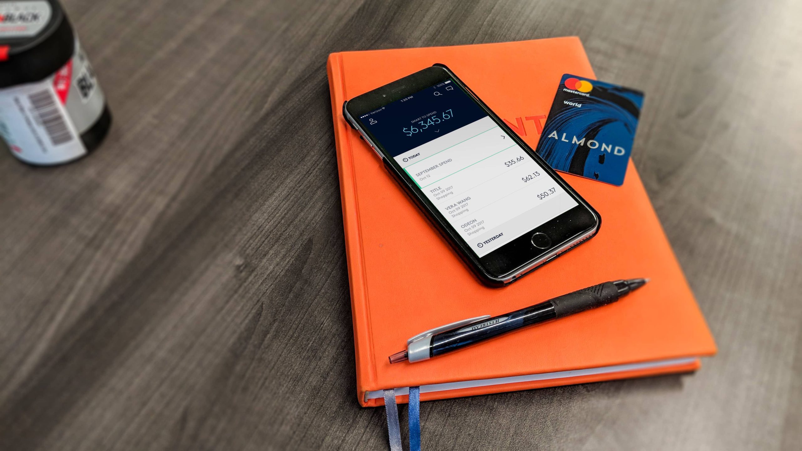
In 2015, Cross River Bank funded a skunkworks project, Almond, to create a modern bank designed for the way people manage their lives and their money.
I was part of this ambitious project to build a modern, mobile-only bank, to re-invent personal banking. As the lead designer, I was responsible for research, discovery, and the key concepts and interactions of the mobile app.
Challenge
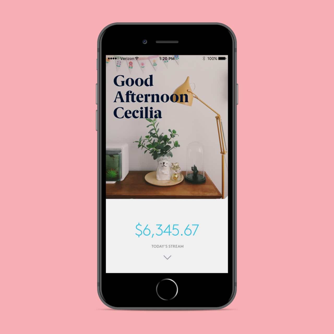
The product vision for Almond was to remove the hassle of day to day banking so that members could focus on whatever matters most to them. In practice a foundational element of that was creating a smarter view of users’ finances that distilled “available balance” into a smarter “how am I doing this month (week, etc.)” and told users how much financial flexibility they really had.
My challenge was to convey that information in the simplest way possible and create that smarter view.
Team & Role
I led product design across all customer touchpoints between October 2015 and November 2017. I worked directly with the Managing Director to define product strategy and prioritize work streams.
Discovery: Understanding the situation
Competitive analysis, industry reports and market research were used to document all the user pain points in the banking landscape. Interviews and surveys with our target user were conducted to understand four main topics:
- The products they used and why
- Specific user challenges with their current products
- How they use banking apps
- How they manage their money
Defining the Problems
I grouped feedback into common pain points to identify areas of opportunity and then mapped it across journeys to pinpoint areas for improvement within the high level experience.

Findings
- Budgeting, managing and tracking money across savings, checking and credit card accounts is a challenge and doesn’t easily answer a primary user concern, “how much money do I really have to spend right now?”
- There is a balancing act between optimizing money by using different accounts or products, and the simplicity of keeping money in one place.
- The two most common user tasks/use cases for mobile banking apps are checking balance and finding recent transactions. Users check to see, How am I doing? Am I off track? What have I spent money on?
And an interesting insight:
- People scan through their transactions to find unfamiliar transactions rather than looking through to find expected transactions.
Solutions
Anchored by the findings, I flipped the problem around: how might we show users how they are doing (financially) in a given month? And what does that mean?
The team identified the dashboard as an opportunity to distinguish Almond from competitors while delivering on our overall goal of providing a financial measuring stick.
Collecting and centralizing billing data
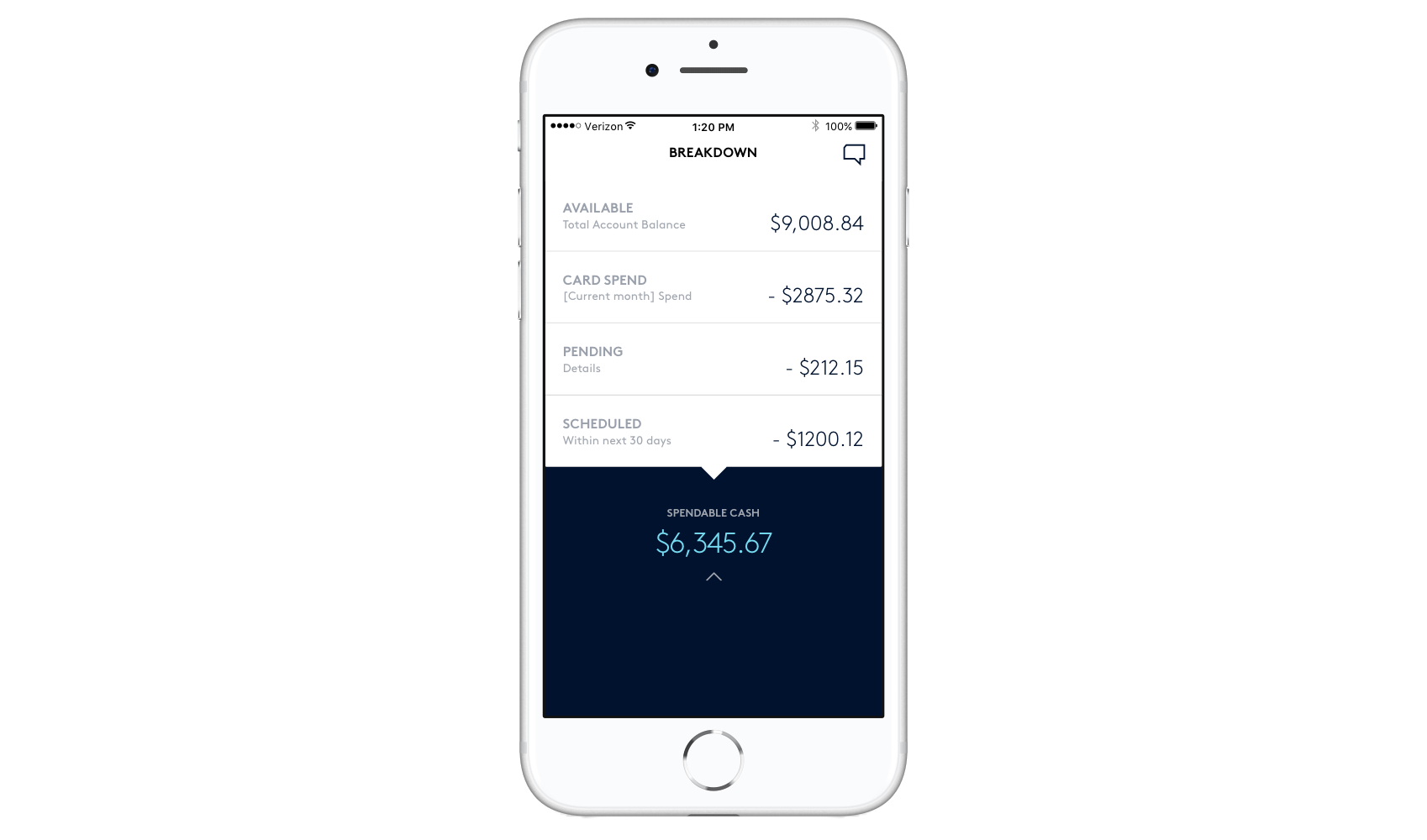
Checking the balance is one of the most common user tasks, but “Available Balance” doesn’t tell you if your rent is about to hit your account. We set out to give a more accurate picture of “Available Balance” by linking recurring payments and accounts like mortgage, cellphone, car payment, and other utilities.
For our target user, these recurring expenses accounted for the vast majority of spending in a month, upwards of 80%.
We accounted for these expenses, first by retrieving the amount due from the biller, and second, amortizing the cost and setting aside money over the month. This meant our synthetic balance, “Spendable cash,” was a much better reflection of available discretionary funds.

Representing money spent
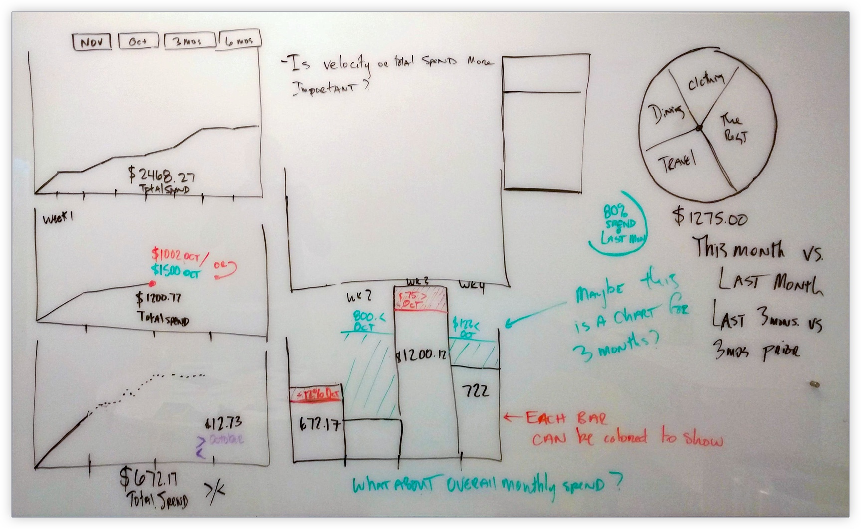
I started by creating a visual approach to show spending and a data feed to show financial history.
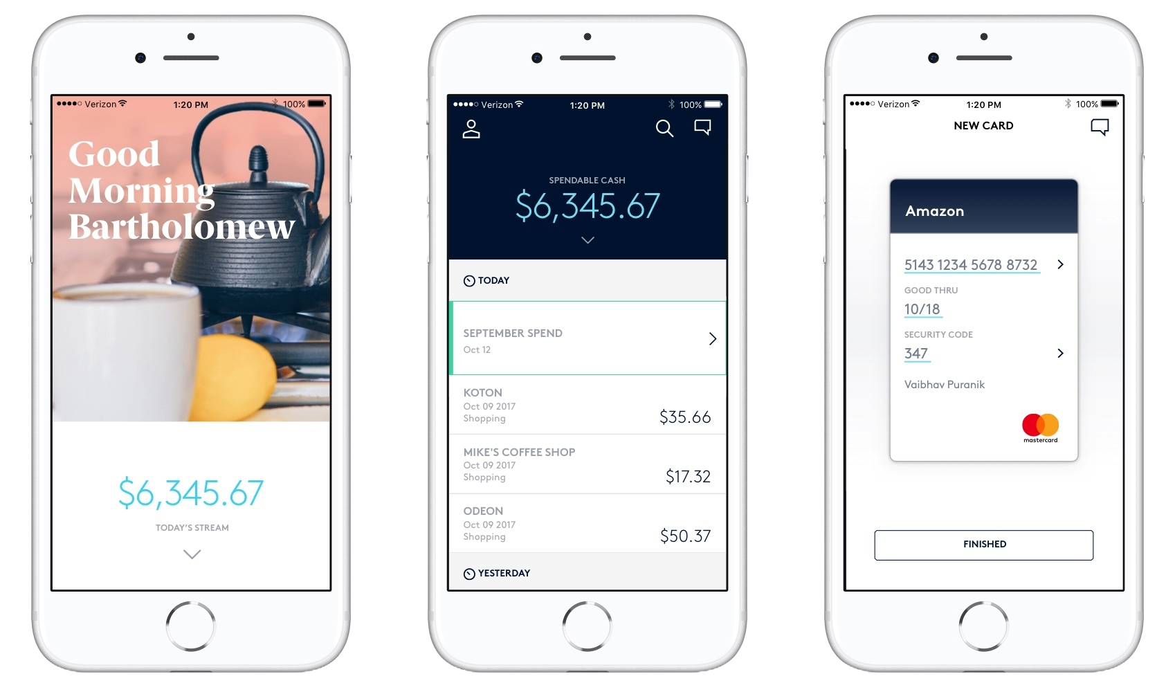
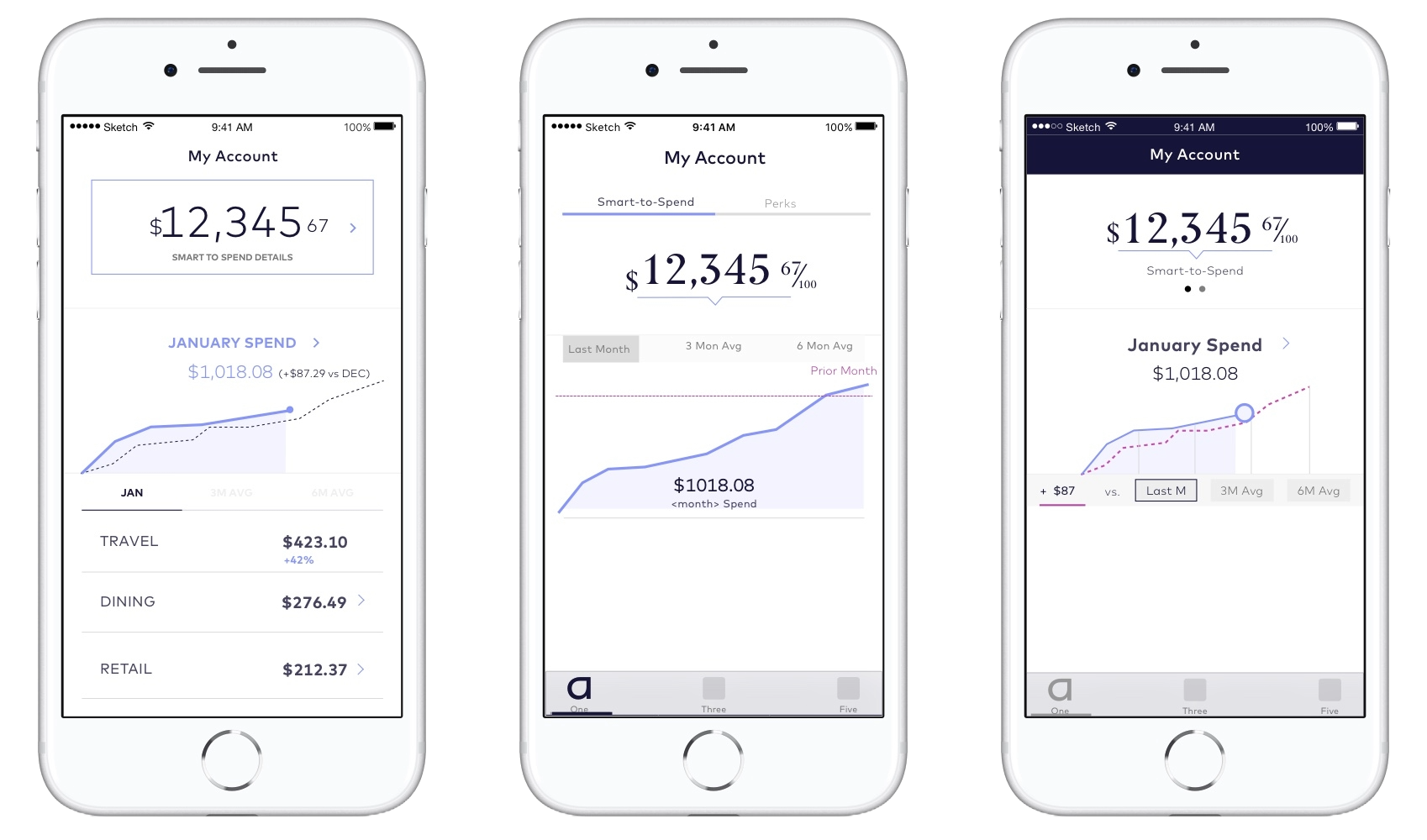
I made balance and cumulative monthly spend the primary elements of the dashboard to show progress over time and provide a concise view of “how you’re doing.” I experimented with many visualizations to illustrate the ratio between these two amounts.
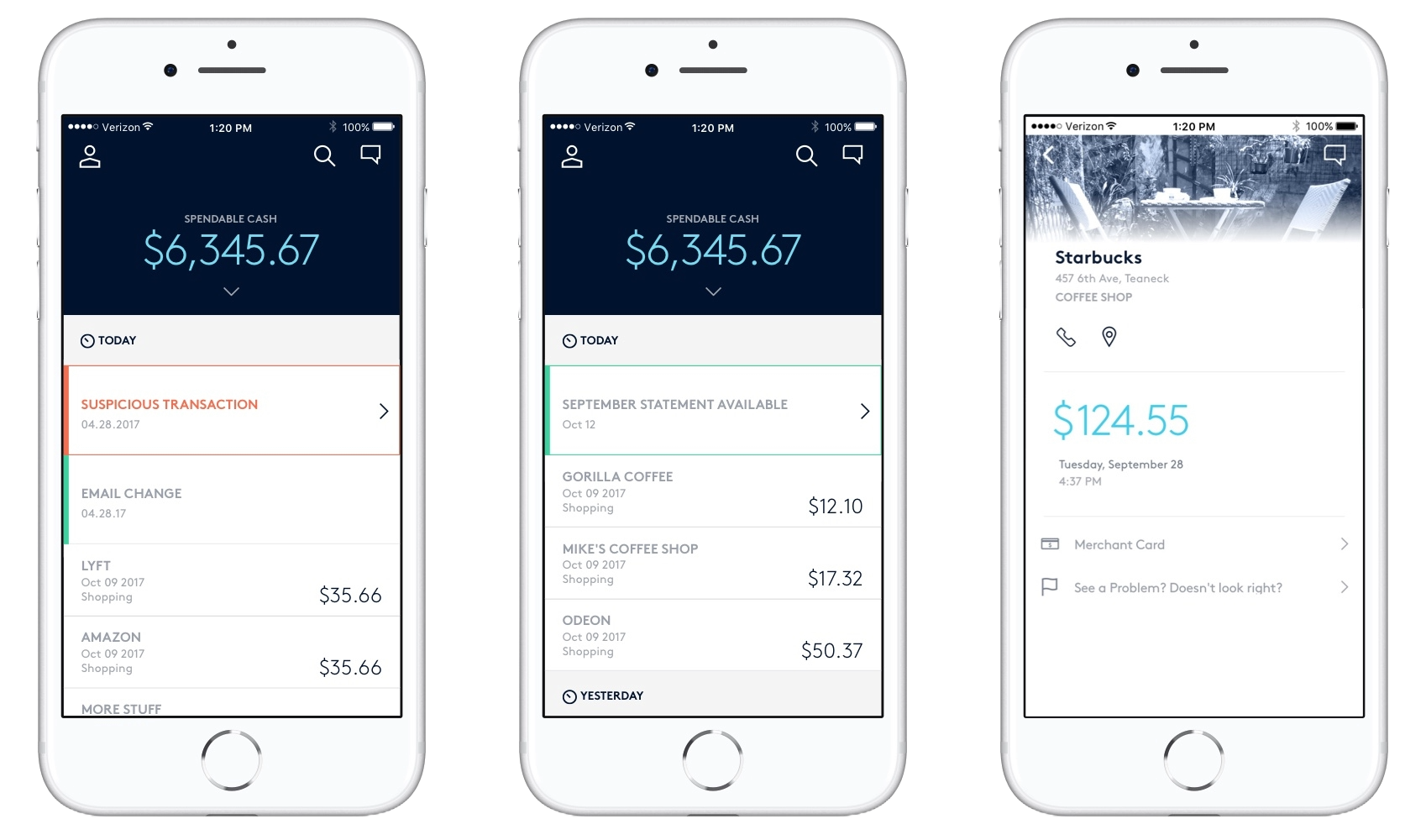
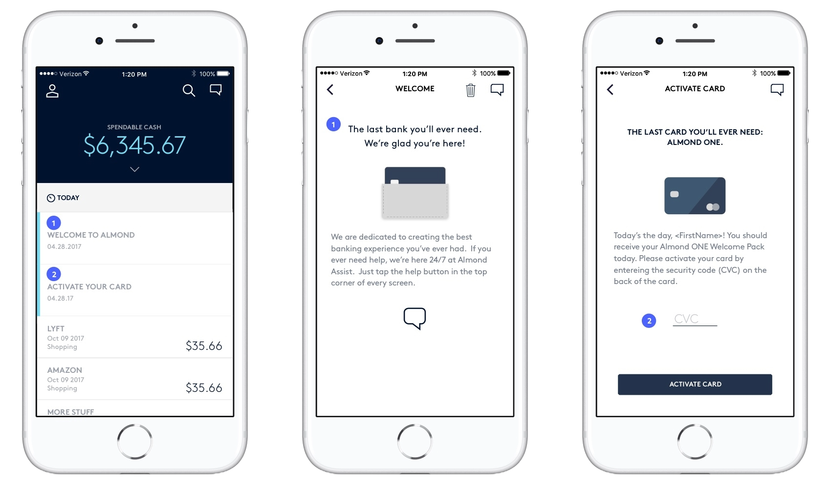
The second design was inspired by social media feeds and was far more data-centric. In addition to transactions within the feed, account notifications and messages were also embedded.

Prototyping & Testing
During user testing, participants understood the first concept, but found that the information wasn’t actionable. In probing deeper, I discovered everyone had their own system to manage the complexity of their specific bills and cash flow. The graph didn’t reflect or match that mental model, and as a result, wasn’t helpful. Additionally, a graph didn’t provide enough context, understanding the what and when of spending was crucial.
In contrast, users immediately found the second concept, Stream, usable, both as a financial layout and as a feed of information. Including messages and statements within the stream meant one integrated data display – users didn’t have to navigate for important information.

What I learned
Though Stream initially appeared less innovative and interesting, users weren’t looking for interesting – particularly as the first thing they saw. Stream was an evolution of the traditional transaction list, providing familiarity and functionality.
A source of anxiety for most people is seeing a transaction they don’t recognize. User testing without personal data can be an exercise in removing context and familiarity – the antithesis of the desired goal.
The Impact
Ultimately, delays in developing the banking core delayed product development and I left the team before the product launched. However, in that time, I led product design to create several creative solutions in a highly regulated industry.
- Designed a fully featured mobile banking experience that included onboarding, payments, and profile functionality in addition to the dashboard.
- Led the design team (including mentoring) and added additional responsibility as the de facto Product Manager lead.
- Managed vendors of all varieties, including branding agency, card manufacturers, and processors to bring product vision to reality.
- I used elements of Design Sprints to create, vet, and test concepts.
- I implemented Lean UX concepts to facilitate team decisions, test, and iterate quickly.
